In the busy towns of Sussex County, Delaware your business has about three seconds to make an impression. Whether someone is driving down Route 16 or Route 113 or walking through downtown Milton, Milford, or Seaford your signage is often the very first “handshake” you have with a potential customer.
At Blue Hen Signs and Design, we’ve spent years helping business owners turn those three seconds into lasting relationships. We’ve seen what works, what fades into the background, and what gets people to pull over and walk through your doors.
If you want your signage to work harder for your bottom line, follow these three essential design principles.
1. Master the Art of Color Contrast
The most beautiful logo in the world won’t help your business if no one can read it from the road. High contrast is the secret weapon of effective signage.
When colors are too similar—like yellow text on a white background or dark blue on black—the human eye struggles to distinguish the letters. For maximum readability, you want a “pop” that creates a sharp edge.
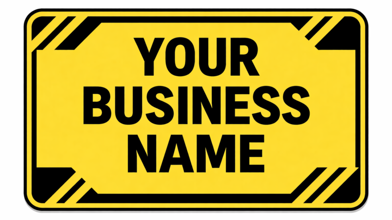
- The Gold Standard: Black text on a yellow background is statistically the most legible combination from a distance.
- The Professional Look: White text on a dark blue or forest green background offers a clean, high-end feel while remaining easy to scan.
As a rule of thumb: if you squint at your design and the text disappears into the background, your contrast isn’t high enough.
2. Embrace the Power of Simplicity
It is tempting to put your phone number, website, list of services, and a full-color photo on a single vinyl banner. However, in the world of outdoor advertising, less is always more.
A cluttered sign is a confusing sign. When a driver is traveling at 45 mph, they can’t process a paragraph of text. Your sign should focus on one primary message.
- The “Rule of Three”: Try to limit your sign to three main elements: your business name (or logo), your primary service, and a clear way to contact you (like a website or phone number).
Leaving “white space” (empty areas) around your text isn’t a waste of material—it’s a visual breather that directs the eye exactly where you want it to go.
3. Size Matters: Prioritizing Roadside Visibility
One of the most common mistakes we see is underestimating the distance from which a sign needs to be read. If your shop is set back 50 feet from the road, a 2-inch tall font might as well be invisible.
The industry standard for readability is the 10-to-100 rule: for every 10 feet of viewing distance, you need at least 1 inch of letter height.
- If you want customers to read your sign from 100 feet away, your primary text should be at least 10 inches tall.
- If you are on a high-speed road like Route 113 or Rt 13, you need to go even larger to account for the speed of travel.
Trust the Local Experts
Blue Hen Signs and Design is a trusted partner for small businesses in Ellendale, Bridgeville, Greenwood and beyond. We don’t just design and print signs; we consult with you to ensure your investment actually grows your business. From vehicle lettering and custom window graphics, to banners and yard signs we bring a personal approach to every project, ensuring your brand is seen, remembered, and respected.
Ready to refresh your look for the season? Contact us today for a free quote, and let’s build something great together.